Visual identity


Brand book & Style guide

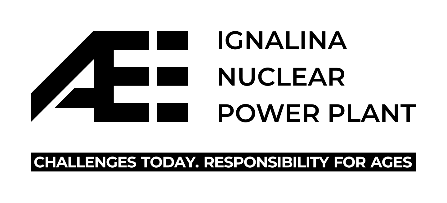
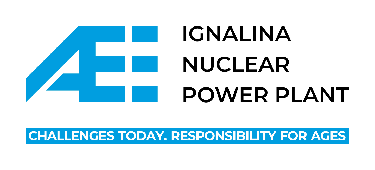
To strengthen the INPP brand, this Brand book & Style guide identifies the main INPP colours, fonts, icons, other tools and establishes the principles of their use.

The main characteristic color of INPP is blue, which has many positive qualities: the color is 
associated with professionalism, promotes trust and security. In addition, this color has been recognized as the color of INPP identity for several decades.

Brand book & Style guide is visual expression of who we are. What we represent and what we seek to become. Our goal is to form a clear image of nuclear power plant, that has a unique experience in the nuclear decommissioning project.


Logo 

(.zip)

for official documentation used to increase the recognizability of the logo for larger print formats with emphasising the mission
for social media and various communication projects used to increase the recognizability of the logo for larger print formats with emphasising the mission
Colour's codes  
Blue
#009CDD
RGB 00, 156, 221
CMYK 100, 0, 0, 0
PANTONE Cyan C
Black
#000000
RGB 0, 0, 0
CMYK 0, 0, 0, 100
PANTONE BLACK 6
IMPORTANT!
Before using these colours, make sure you have the correct colour codes.
Fonts
used 
Main font:
- Montserrat Bold
- Montserrat Medium
- Montserrat Regular
- Montserrat Light
Alternative font:
- Verdana Pro Bold
- Verdana Pro Semibold
- Verdana Pro Regular
- Verdana Pro Light
Photo gallery Photos from the gallery can be used with the @IAE archive.